The Daily Parker

Politics, Weather, Photography, and the Dog

On the reading stack

These crossed my various news feeds today:

I've now got to really understand the implications of the EU ruling. More when I do.

Where is your neighborhood?

Local-news organization DNAinfo asked people to draw their neighborhood boundaries a while back. They now have results:

After getting thousands of drawings from DNAinfo readers, we wanted to show where there was broad agreement (and disagreement) about where each begins and ends.

On first glance, both Boystown and Wrigleyville residents make clear where they think their neighborhoods are.

The core of Wrigleyville — appropriately around Wrigley Field — is between Grace, Racine, Sheffield and Newport, readers say.

Boystown's core is Halsted, Addison, Broadway and Belmont.

But look at both maps and you'll see how people in both neighborhoods are staking claim to the other's territory. A large number of readers think Boystown goes right up to Wrigley Field and several Wrigleyville residents think their neighborhood goes right up to Halsted.

I love stuff like this.

Two must-see posts

First, Bruce Schneier warns about living in a Code Yellow world:

The psychological term for this is hypervigilance. Hypervigilance in the face of imagined danger causes stress and anxiety. This, in turn, alters how your hippocampus functions, and causes an excess of cortisol in your body. Now cortisol is great in small and infrequent doses, and helps you run away from tigers. But it destroys your brain and body if you marinate in it for extended periods of time.

Most of us...are complete amateurs at knowing the difference between something benign and something that's actually dangerous. Combine this with the rarity of attacks, and you end up with an overwhelming number of false alarms. This is the ultimate problem with programs like "see something, say something." They waste an enormous amount of time and money.

You also need to see these satellite photos.

And I need to do more work.

Lynx

I lost my Kindle on the flight to London last week, and only just got its replacement yesterday afternoon. Good thing, too, because I'm loading it up with articles I can't read until later:

And now I have to draft a statement of work...

Fifty

I happened to notice just now that the plane I'm on passed within a few hundred meters of 50°N and 50°W, just over the Grand Banks east of Newfoundland. That I was able to notice this goes in the category of things called "I love living in the future," as it involved a mobile phone with GPS and enough memory to store a kilometer-resolution map of the entire hemisphere in its Google Maps app cache.

Within five years we'll have ubiquitous Internet worldwide, and this will seem as quaint as one of Darwin's diary entires from the Galapagos, of course.

I would also like to shout out to American Airlines, who upgraded me on an international segment without me asking—or even realizing it was a possibility. Now, I understand the business reason: they had oversold coach with empty seats in business class. But the gate agent at O'Hare called me personally, on my mobile phone, after I boarded, to give me the upgrade. Why they chose me isn't as much a mystery as I'd like it to be (fare class, elite status), but still, it's not like my loyalty to American or oneworld is flagging. Maybe this kind of treatment is why?

The less-interesting bits of the State Fair

The point of the Illinois State Fair is food. Despite most people in the state living in urban or suburban areas, most of the state's area is agricultural. So when one goes to the fair, one eats. A lot.

That said, a remarkable proportion of food choices at the fair are fried meats. Even in the "ethnic village" section, where ostensibly they have about 20 different cuisines represented, things aren't quite...ethnic:

At least this year the Romanian kiosk wasn't covered in vampires. But still...not sure what's Romanian about elephant ears and polenta.

Also, we observed a skunk slink under a wall into the Greek kiosk after it closed. I sure hope he left before they opened the next morning.

The Prime Meridian isn't where you think

Via IFLS, the Independent reported yesterday that the Prime Meridian is not at 0°W:

Every year, hundreds of thousands of tourists from all over the world descend on the Royal Observatory in Greenwich to pose for a photograph astride the Prime Meridian, the famous line which divides the eastern and western hemispheres of the earth.

There is just one problem: according to modern GPS systems, the line actually lies more than 100 metres to the east, cutting across a nondescript footpath in Greenwich Park near a litter bin. Now scientists have explained why – and it all comes down to advances in technology.

According to a newly published paper on the discrepancy, which has existed for many years, tourists who visit the observatory at Greenwich often discover that they “must walk east approximately 102 meters before their satellite navigation receivers indicate zero longitude”.

I've visited the Royal Greenwich Observatory a couple of times, first in 2001. This sign was inaccurate then, but most people didn't realize it:

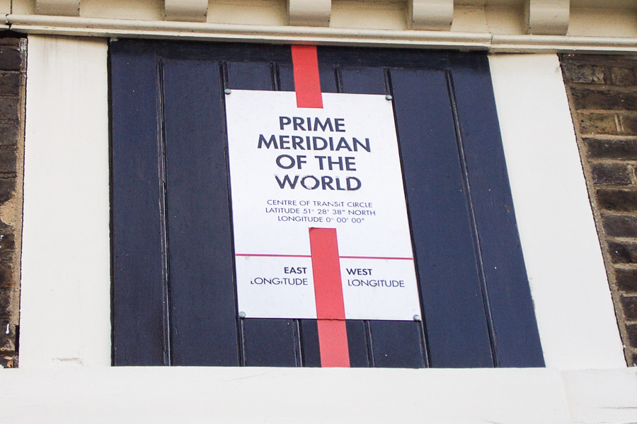
If you look at that photo's metadata, you can see the GPS location that I added using the mapping feature of Adobe Lightroom. According to Google Maps, the monument is actually at 0°0'5"W.

But the Prime Meridian was always primarily a reference point for time, not space, and therefore is exactly in the right place. As a commenter on the IFLS post pointed out:

The article uses the term "wrong" when in actuality Greenwich Mean Time (GMT) is still based on the Prime Meridian, though with the network of atomic clocks it isn't used much anymore, however the marker itself is very much in the right place. It is just when you use the coordinates on a GPS you end up at a different location. This is because GPS doesn't use the Prime Meridian as a starting point. GPS uses multiple locations all across the globe as anchor points in which to triangulate a location from called the geodetic system. The system does not rely on fixed straight lines as we see on a map but rather contours to the physical and gravitational shape of the Earth. So in essence just as the gig line (navy term) of my shirt doesn't lie straight and flat across by oversized 50 year old belly neither does the imaginary geodetic lines. These imaginary lines if drawn on a map would deviate east and west and would appear wavy. In the end, it is not about being wrong (as the article implies) but rather why do the two systems not match up.

(See? Sometimes comments on the Internet are reasoned and mostly correct.)

And this is science, too. As the Royal Observatory's public astronomer Dr Marek Kukula told the Independent, “We’re forever telling this story, making the point that as we refine our measurements and get better technology of course these things change, because we want to have the best possible data."

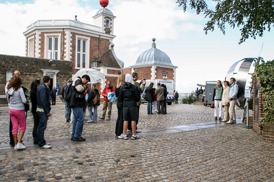
As a bonus, here's a photo from my most recent visit, in 2009. Look at all the tourists lining up on the 5-seconds-west line:

Flags of our Kiwis

New Zealand is voting over the next year to replace its national flag:

It’s not everyday that a nation chooses a new flag by its own volition, with the support of the voters, without any drastic regime changes. New Zealand is doing exactly that. With the Flag Consideration Project, the Kiwis are trying on a new look.

In an open letter to the peoples of New Zealand, the panel for the Flag Consideration Project introduced 40 finalist designs for an all-new flag. Voters will decide what happens next in two referendums: one in November–December, and another in March 2016.

Here are a couple of the finalists:

Getting warmer

So far Chicago has had a milder-than-normal summer, with only a couple of over-32°C days and a lot of rain. Given our greenhouse gas emissions, that will change:

The NASA climate projections offer a detailed view of future temperature and precipitation patterns around the world at a 15.5 mile (25 kilometer) resolution, covering the time period from 1950 to 2100. The 11-terabyte dataset provided daily records and estimates of maximum and minimum temperatures and precipitation over the entire globe. It integrates actual measurements from around the world with data from climate simulations created by the international Fifth Coupled Model Intercomparison Project, or CMIP, which is a standard experimental protocol for studying the output of coupled atmosphere-ocean general circulation models.

The result? Pretty warm:

I won't be around to experience an average annual temperature around 30°C. Unfortunately, given the effects of climate change on our food and water supplies, not many others might be either.

Strong El Niño forming this year

Jeff Skilling at the Chicago Tribune updates us on the equatorial Pacific:

The current El Nino comes together against a backdrop of warming oceans and oceans which are growing more acidic as they observe mass quantities of CO2 produced through the burning of fossil fuels and the release of CO2 into the atmosphere this produces. More on the rate at which the planet’s oceans are warming here. It’s estimated that the warming which has taken place in the world’s oceans since 1990 is the equivalent of having exploded 5 Hiroshima strength nuclear bombs in the our planet’s oceans every second over the 25 year period. The warming oceans may be impacting the strength of the current El Niño. For more, click here.

What can we expect in the next few months? Most likely, increased precipitation in California, heavier than normal precipitation this fall and winter in the South, and a milder winter here in the midwest. However, with the ridiculously resilient ridge over the western U.S. and Canada, this year's El Niño could be completely different. Can't wait to find out.